Question: -6(a) what is coolbar? How is it created and used? Explain its important features.
Answer: – CoolBar control is a container control, able to host child controls. It consists of a collection of one or more resizable regions known as bands. Each band can host a single child control.
Using the CoolBar control is the same as using most other ActiveX controls, with the following exceptions.
Adding Controls to a CoolBar
The method for adding child controls to a CoolBar control is slightly different from that of adding controls to other containers. The control must first be associated with a Band object; there is a limit of one child control per band.
To add a control to a CoolBar: with the CoolBar control selected, select a control from the ToolBox and draw it on the CoolBar. Open the Property Page for the CoolBar and select the Bands tab. Use the Index buttons to select the index of the Band object on which you want the control to appear. Select the control from the Child list. The child control will then move and resize along with the Band object at run time.
If you simply add a control without associating it to a band, it will appear as a floating control over the CoolBar at run time. To avoid this situation, set the Visible property of the control to False.
You can have additional controls contained on a CoolBar and swap them in and out at run time using the Child property of the Band object.
Displaying Pictures on a CoolBar
The CoolBar control provides several properties that allow a great deal of flexibility in displaying pictures.
When you assign an image to the Picture property of the CoolBar control, that image will be tiled seamlessly across all bands, behind any child controls. By setting the FixedBackground property of a Band object to False, the Image will be tiled within that band.
The Band object has a Picture property that allows you to display a different background picture when the UseCoolbarPicture property is set to False. The Band object also has an Image property which can be used to display an icon to the right of the move handle.
The EmbossPicture property can be used to force an image to be displayed in two colors, similar to the Internet Explorer toolbar. The two colors to be used are determined by the EmbossHighlight and EmbossShadow properties.
When the EmbossPicture property is set to True, the image assigned to the Picture property will be dithered to the EmbossHighlight and EmbossShadow colors. The dithering process uses a fixed threshold to determine which colors in the image will be mapped to the highlight and shadow colors. Choose images with a good definition between dark and light colors for best results.
Using Other Controls with the CoolBar
There are certain limitations to the controls that can be used as child controls on a CoolBar control.
The CoolBar control can only host controls which expose a Window handle. Lightweight controls such as Label, Image, and Shape controls don’t expose a Window handle and can’t be used. Although you can place these controls on the CoolBar, they won’t appear at run time and won’t be listed in the Child list box on the Property Page.
Although each band in the CoolBar control can only host a single child control, you can get around this limitation by placing a container control (such as a PictureBox) on the band and hosting additional controls within that container. Keep in mind that if you do this, you will need to create the code to resize the nested controls in response to changes in the CoolBar.
Some controls may not behave as expected when contained within a CoolBar control. For example, a contained Toolbar control won’t paint properly when its Wrappable property is set to True and the CoolBar is resized. To avoid this problem, set the Wrappable property to False.
Question: -6(b) Explain various graphic functions available in VB with an example.
Answer: -There are four basic controls in VB6 that you can use to draw graphics on your form: the line control, the shape control, the image box and the picture box. To draw a straight line, just click on the line control and then use your mouse to draw the line on the form. After drawing the line, you can then change its color, width and style using the BorderColor, BorderWidth and BorderStyle properties.Similarly, to draw a shape, just click on the shape control and draw the shape on the form. The default shape is a rectangle, with the default shape property set at 0. You can change the shape to square, oval, circle and rounded rectangle by changing the shape property’s value to 1, 2, 3 , 4, and 5 respectively. In addition, you can change its background color using the BackColor property, its border style using the BorderStyle property, its border color using the BorderColor property as well its border width using the BorderWidth property.
The program in this example allows the user to change the shape by selecting a particular shape from a list of options from a list box, as well as changing its color through a common dialog box.
The objects to be inserted in the form are a list box, a command button, a shape control and a common dialog box. The common dialog box can be inserted by clicking on ‘project’ on the menu and then select the Microsoft Common Dialog Control 6.0 by clicking the check box. After that, the Microsoft Common Dialog Control 6.0 will appear in the toolbox; and you can drag it into the form. The list of items can be added to the list box through the AddItem method. The procedure for the common dialog box to present the standard colors is as follows:
CommonDialog1.Flags = &H1&
CommonDialog1.ShowColor
Shape1.BackColor = CommonDialog1.Color
The last line will change the background color of the shape by clicking on a particular color on the common dialog box as shown in the Figure 18.1 below:
The Code
Private Sub Form_Load()
List1.AddItem "Rectangle"
List1.AddItem "Square"
List1.AddItem "Oval"
List1.AddItem "Circle"
List1.AddItem "Rounded Rectangle"
List1.AddItem "Rounded Square"
End Sub
Private Sub List1_Click()
Select Case List1.ListIndex
Case 0
Shape1.Shape = 0
Case 1
Shape1.Shape = 1
Case 2
Shape1.Shape = 2
Case 3
Shape1.Shape = 3
Case 4
Shape1.Shape = 4
Case 5
Shape1.Shape = 5
End Select
End Sub
Private Sub Command1_Click()
CommonDialog1.Flags = &H1&
CommonDialog1.ShowColor
Shape1.BackColor = CommonDialog1.Color
End Sub


18.3 PSet, Line and Circle Drawing Methods
Other than using the line and shape controls to draw graphics on the form, you can also use the Pset, Line and Circle methods to draw graphics on the form.
18.3.1 The Pset Method
The Pset method draw a dot on the screen, it takes the syntax
Pset (x , y ), color
(x,y) is the coordinates of the point and color is its color. To specify the color, you can use the color codes or the standard VB color constant such as VbRed, VbBlue, VbGeen and etc. For example, Pset(100,200), VbRed will display a red dot at the (100,200) coordinates.
The Pset method can also be used to draw a straight line on the form. The procedure is
For x= a to b
 Pset(x,x)
Next x
This procedure will draw a line starting from the point (a,a) and to the point (b,b). For example, the following procedure will draw a magenta line from the point (0,0) to the point (1000,1000).
For x= 0 to 100
 Pset(x,x) , vbMagenta
Next x
18.3.2 The Line Method
Although the Pset method can be used to draw a straight line on the form, it is a little slow. It is better to use the Line method if you want to draw a straight line faster. The format of the Line command is shown below. It draws a line from the point (x1, y1) to the point (x2, y2) and the color constant will determine the color of the line.
Line (x1, y1)-(x2, y2), color
For example, the following command will draw a red line from the point (0, 0) to the point (1000, 2000).
Line (0, 0)-(1000,2000), VbRed
The Line method can also be used to draw a rectangle. The syntax is
Line (x1-y1)-(x2, y2), color, B
The four corners of the rectangle are (x1-y1), (x2-y1), (x1-y2) and (x2, y2)
Another variation of the Line method is to fill the rectangle with a certain color. The syntax is
Line (x1, y1)-(x2, y2), color, BF
If you wish to draw the graphics in a picture box, you can use the following syntaxes
Picture1.Line (x1, y1)-(x2, y2), color
Picture1.Line (x1-y1)-(x2, y2), color, B
Picture1.Line (x1-y1)-(x2, y2), color, BF
Picture1.Circle (x1, y1), radius, color
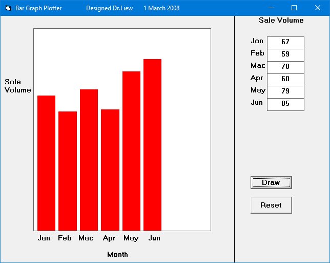
Example 18.3 The Bar Graph Plotter
We shall use the knowledge we gained from the Line method to create a bar graph. In this program, we shall insert a picture box for drawing the bar graph. In addition, we insert six text boxes for accepted the user input. We also insert two command buttons for drawing and reseting. Besides that, we need to define a new origin using the Scale method, otherwise, the bar graph will be upside down. The code is
Picture1.Scale (0, 5000)-(5000, 0)
The Code
Private Sub Command1_Click()
Dim sale1, sale2, sale3, sale4, sale5, sale6 As Integer

sale1 = Val(Txt_Jan.Text)
sale2 = Val(Txt_Feb.Text)
sale3 = Val(Txt_Mac.Text)
sale4 = Val(Txt_Apr.Text)
sale5 = Val(Txt_May.Text)
sale6 = Val(Txt_Jun.Text)

Picture1.Line (100, 0)-(600, sale1 * 50), vbRed, BF
Picture1.Line (700, 0)-(1200, sale2 * 50), vbRed, BF
Picture1.Line (1300, 0)-(1800, sale3 * 50), vbRed, BF
Picture1.Line (1900, 0)-(2400, sale4 * 50), vbRed, BF
Picture1.Line (2500, 0)-(3000, sale5 * 50), vbRed, BF
Picture1.Line (3100, 0)-(3600, sale6 * 50), vbRed, BF
Picture1.Line (3700, 0)-(4200, sale7 * 50), vbRed, BF
Picture1.Line (4300, 0)-(4800, sale8 * 50), vbRed, BF

End Sub

Private Sub Command2_Click()
Txt_Jan.Text = ""
Txt_Feb.Text = ""
Txt_Mac.Text = ""
Txt_Apr.Text = ""
Txt_May.Text = ""
Txt_Jun.Text = ""

Picture1.Cls

End Sub

Private Sub Form_Load()
'To redefine the coordinates of the origin
Picture1.Scale (0, 5000)-(5000, 0)

End Sub
The Output
18.3.3 The Circle Method
The Circle Method Draws a circle, ellipse, or arc on an object such as a form or a picture box. The syntax is :
object.Circle (x, y), radius, color, start, end, aspect
Where
- (x,y) indicate the coordinates of the center of the circle
- color indicates the color of the circle’s outline
- start and end indicate the starting position and ending position in radian of an arc or a sector
- aspect indicates the aspect ratio of the circle. The default value is 1.0, which yields a perfect (non-elliptical) circle.
For example, the procedure
Form1.Circle (400, 400),500, VbRed
Question: -7(a) What is the use of tab strip control in VB? Explain how tabs are added and deleted at run time.
Answer:- The TabStrip can be tricky because you maybe expect it to be a container but it’s not. If you want to design tabs on a form where each tab’s content looks different, use the SSTab control that ships with VB.
The TabStrip control, in my view, is useful mainly where you are displaying the same type of thing within the control but you need different ‘headings’.
For example, imagine you have a TabStrip and it contains boxes to enter an address. Your tabs might say “Home”, “Work”, “Parent’s”. Depending on the tab that is clicked, you display a different address, but the basic layout is always the same.
To add tabs, simply use TabStrip1.Tabs.Add …
To work with the selected tab, use TabStrip1.SelectedTab
Remember that Tabs start at 1, not 0.
Bear in mind that some VB controls, such as a Label, will always disappear behind a TabStrip and can’t be forced onto the top of it, so if you want to draw labels and things on your TabStrip you might want to place them in a PictureBox or SSPanel container first, and then stick that inside the TabStrip control.
To add a tab programmatically
- Use the Add method of the TabPages property.
string title = “TabPage ” + (tabControl1.TabCount + 1).ToString(); TabPage myTabPage = new TabPage(title); tabControl1.TabPages.Add(myTabPage);
To remove a tab programmatically
- To remove selected tabs, use the Remove method of the TabPages property.
-or-
- To remove all tabs, use the Clear method of the TabPages property.
// Removes the selected tab: tabControl1.TabPages.Remove(tabControl1.SelectedTab);
// Removes all the tabs: tabControl1.TabPages.Clear();
Question: -7(b) Explain RGB and other color related methods with an example.
Answer: – Returns a Long whole number representing an RGB color value. Syntax RGB( red, green, blue ) The RGB function syntax has these named arguments:
| Part | Description |
| red | Required; Variant (Integer). Number in the range 0-255, inclusive, that represents the red component of the color. |
| green | Required; Variant (Integer). Number in the range 0-255, inclusive , that represents the green component of the color. |
| blue | Required; Variant (Integer). Number in the range 0-255, inclusive, that represents the blue component of the color. |
Remarks Application methods and properties that accept a color specification expect that specification to be a number representing an RGB color value. An RGB color value specifies the relative intensity of red, green, and blue to cause a specific color to be displayed. The value for any argument to RGB that exceeds 255 is assumed to be 255. The following table lists some standard colors and the red, green, and blue values they include:
| Color | Red Value | Green Value | Blue Value |
| Black | 0 | 0 | 0 |
| Blue | 0 | 0 | 255 |
| Green | 0 | 255 | 0 |
| Cyan | 0 | 255 | 255 |
| Red | 255 | 0 | 0 |
| Magenta | 255 | 0 | 255 |
| Yellow | 255 | 255 | 0 |
| White | 255 | 255 | 255 |
The RGB color values returned by this function are incompatible with those used by the Macintosh operating system. They may be used within the context of Microsoft applications for the Macintosh, but should not be used when communicating color changes directly to the Macintosh operating system.
Example
This example shows how the RGB function is used to return a whole number representing an RGB color value. It is used for those application methods and properties that accept a color specification. The object MyObject and its property are used for illustration purposes only. If MyObject does not exist, or if it does not have a Color property, an error occurs.
Dim RED, I, RGBValue, MyObjectRed = RGB(255, 0, 0) ‘ Return the value for Red.I = 75 ‘ Initialize offset.RGBValue = RGB(I, 64 + I, 128 + I) ‘ Same as RGB(75, 139, 203).MyObject.Color = RGB(255, 0, 0) ‘ Set the Color property of ‘ MyObject to Red.
Other Color Method
For example
In VB:
textBox1.BackColor = Color.Linen
But what if you want to display a color that is not one of the named colors? Then you can use the Color.FromArgb method to define your color by specifying the red, green, and blue values.
In VB:
textBox1.BackColor = Color.FromArgb(250, 245, 235)
Ah, but what if you have the color defined as a hexadecimal value? Well, you could use Bing/Google to find a converter to convert it to RGB. Or you can use the ColorTranslator.FromHtml method.
In VB:
textBox3.BackColor = ColorTranslator.FromHtml(“#FAF9F9”)
This article is contributed by Tarun Jangra. Please write comments if you find anything incorrect, or you want to share more information about the topic discussed above.